Wednesday 3 December 2014

Blogmas Day 3:Budget Christmas Party Make-Up


So it's the most glamorous time of year, with multiple opportunities for us ladies to adorn ourselves head-to-toe in glitter, sequins and bling galore. 

For me, picking out something to wear for work's Christmas party or New Years Eve is the easy part. Make-up is where I usually struggle. Now you may remember a while back I reviewed the MUA Undressed Palette as well as some other MUA products in a haul that I did (which you can read here). 

I waxed lyrical about the MUA palette because at only £4, it's a carbon copy of the Urban Decay Naked Palette in terms of shades, and the pigmentation is dense and rich. 

So I decided to knock up a few eye shadow looks using the palette to give you some budget beauty inspiration. 

You'll notice that the shades actually come in pairs made up of a matte shade and a metallic shade. Each of these looks consist of a pair, with the matte shade covering the lid all the way up to the crease, and the metallic shade blending outwards from the crease up, to create a winged shape. In all of these looks, I have used shade No.1 as a highlighter for just below my brow and the inner corner of my eye. 

Shades 1 & 2


 This is the gentlest of all the looks. Even though I use shade 1 as a highlighter most of the time, it also works really well on the lid, accompanied by shade 2. If you're going for a natural make-up look but want just a little bit of colour and highlighting, these shades are perfect. These icy pinks are great for both day and night winter looks. 

Shades 3 & 4


This is a very gentle combo. I like to think of these shades as rose gold in hue. They add a little bit of warmth and depth to the lid but are at the same time are quite natural in tone. If you've got quite a dramatic outfit, something like this would work really well. 
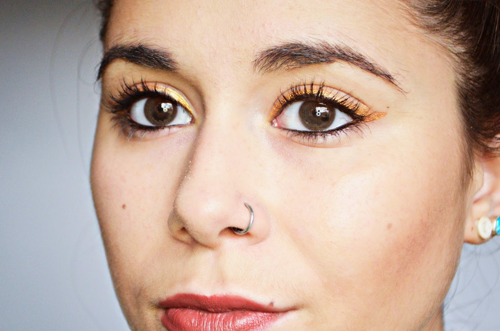
Shades 5 & 6


Everyone needs a bit of gold on them somewhere at Christmas, and gold make-up can be the perfect sparkly Christmas accessory. These shades are subtle, but work to add a warm glow to your eyes, 

Shades 7 & 8


I like to think of this combo as a bronze smokey eye. Both the matte and the metallic are two differing depths of bronze, and they work so well together. This combo will look amazing on anyone with brown eyes, as it really makes them pop. 

Shades 9 & 10


 I love the pinky metallic with the chocolate brown here. The brown gives depth to the eyelid and the muted pink makes for a good contrast. 
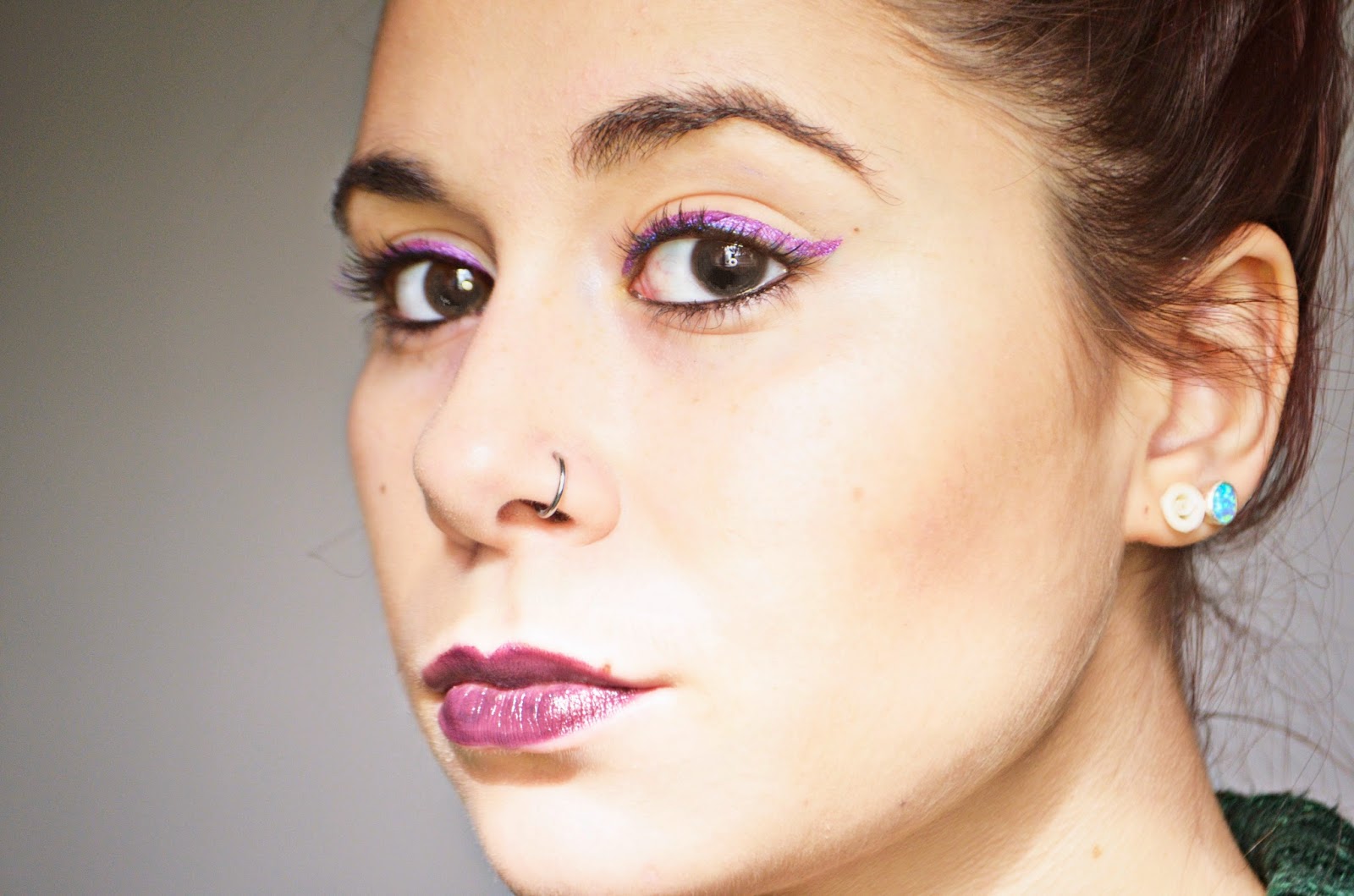
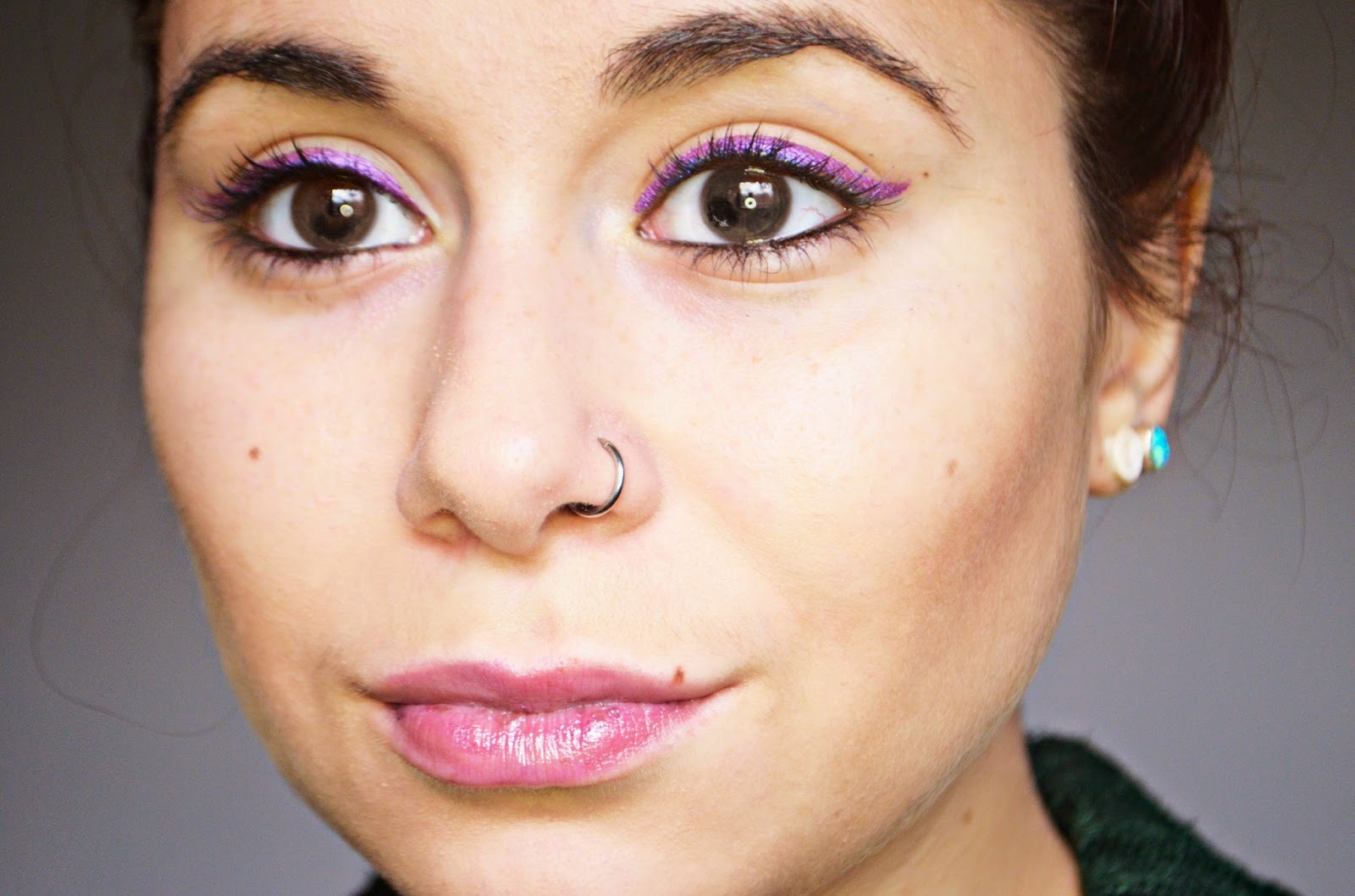
Shades 11 & 12


This look is one of my favourites. The metallic blue gives a nice twist to the smokey eye, and helps to create a defined wing. This is the most dramatic look of them all. This is a statement look, and would work well with a subtle and understated outfit. 


READ MORE

Thursday 27 November 2014

Dry Shampoo: Battle of the Brands


Thank God for dry shampoo. Am I right? On days of unexpected greasiness slash laziness, it's an absolute lifesaver. 

I say this, but before now I didn't use it a lot at all. My hair doesn't get too greasy too quickly and when it does, it's also crying out for a good conditioning, so dry shampoo wasn't really my go-to in those situations. 

However since dyeing my hair a colour that fades rapidly with each wash, dry shampoo is helping me prolong my colour's vibrancy, and is a product that I would recommend to anyone struggling with fast-fading hair. 

Whenever I go to a fashion event, dry shampoo is a product that without fail makes its way into the goodie bags.  I've accumulated quite a few now, so I thought I'd  put the three biggest brands (Batiste, Tresemme and label,m) to the test on my new barnett in a battle of the brands, testing them on grease-elimination and volume. 

Obviously the most well-known, with Pixie Lott fronting their latest ad campaign and a variety of different scents and patterned cans on the shelves. The variety that Batiste has to offer is vast, and I will admit that it smells amazing. It does the job perfectly well in terms of eliminating the greasy bed-head look, however when it comes to styling and adding more volume, if you've got a gargantuan head of hair like mine, it just won't cut it. With my hair being so heavy, I need as much help as I can get when it comes to creating volume. I was also left with quite a powdery texture in my hair which really dried it out. 

For me, Tresemme is a brand I really trust. I've had a lot of success with their conditioners in the past, and I wasn't let down by this product either. I found that I needed less than I did with Batiste, and the actual feel of the product on  my hair was, as it says, refreshing. It didn't feel powdery or dry and doesn't leave any white residue at all. Didn't even need to rub it in really. Again my hair was too heavy for this to have any voluminous effect, but for a fresh, shampooed effect, this one is my favourite. A bit more expensive than Batiste, but you'll use less and it will last you longer. 

Obviously I don't use this at the moment, but when my hair was ombre I did. I know the can is tiny, and it's just a sample size. This is my favourite for texture and volume. It's the one product that can actually take on my hair and give it some lift, so if you've got a thick head of hair, or just want something a bit more heavy duty, then this is what you need. For dry shampooing, it's got a brown tint to it so that it doesn't leave any powdery marks, and it actually works well on reddy / auburn hair too. I've also tried and reviewed the larger Texturising and Volume spray which is actually quite similar, just more aimed at styling.  They're both brilliant for spraying on your hair before curling or backcombing for some extra hold and lift, whilst leaving the hair soft and pliable. 


READ MORE

Wednesday 26 November 2014

Colour Conundrum: From Lipsticks to Skin-Tone; Know Your Colours


As you'll know, I wanted to dye my hair purple for ages. I loved my ombre, but was getting a bit bored and wanted to try something new. I am so in love with it (despite the high maintenance upkeep needed) however I've had to make a few day-to-day changes that I really didn't consider whilst planning it, and I thought I'd share them with you guys, so you're a little more prepared than me if you do the same, and it all revolves around colour. 

Maybe I was a bit naive when choosing a colour to dye my hair without considering that it would have a knock-on effect on my skin-tone and what colour clothes I would and wouldn't be able to wear, but as someone who before now had only dyed their hair red, I think I can be excused. And I know I'm not the only one. Having had a few weeks to adjust to this, I can now spot the same problem on other people who haven't made these changes, or have just ignored the fact that they need to, and it has a horrible effect on the way their hair looks. 

When my hair was freshly dyed and dried, I got a bit of a shock. Imagining a colour as drastic as this is never the same as seeing it on you for the first time. I loved the colour, but it just did not match my face. I couldn't get the two to connect, and I panicked. The make-up I'd been wearing when my hair was ombre now looked washed out with an unhealthy pallor and certain items in my wardrobe clashed. 

Looking back, this was obviously going to happen, but I think I was so caught up in the excitement of a change, that I never considered this. Luckily, I have a Mum who did both hairdressing and interior design, so she has passed on to me a great knowledge and understanding of colours and tones that helped me solve this issue in a jiffy, and I hope it can help you too. Even if you haven't dyed your hair, having this information may help you in the future when choosing certain colours, whether it's for clothes or make-up. I am no beauty expert, this is just some advice I've been given as well as what's worked for me, so here's a few things to maybe bear in mind: 


Skin-Tone
Before you do anything like this, you need to have a good understanding of what your skin-tone actually is. Some people go a lifetime without ever really knowing, and high-street make-up brands do not help. A lot of colours of lipsticks and eyeshadows sold by these high-street brands are blue in tone, which means they can look quite jarring and wash out anyone with warmer skin. To this day I still struggle to find a budget red lipstick that doesn't make me look like something from the Adams family. Your skin-tone is either warm, neautral, or cool. The quickest way to figure this out is the vein test - if your veins are a purpley-blue, you're cool toned, and if they're greener in tone, you're warm toned. Knowing this will not only help you with your current colour choices, but have an understanding of what effect future colour decisions will have. 

So in my situation, I am warm in tone, however the purple dye I used had a blue undertone. Luckily, purple still came through, giving it a bit of warmth, but it was the blue that clashed with my dark, bronze toned foundation and blusher. 


Make-Up
Understanding warm and cool tones can help you decide where certain make-up shades lie in connection with your skin.  I like to split the make-up colour spectrum into four groups: dark warm, light warm, dark cool, light cool. I was wearing light warm shades before, but since my blue-toned hair has washed me out a bit, I've had to balance it out with some extra warmth. I've also toned down my eyeliner, which before was a statement, but now my hair is my statement, so I my make-up needs to be more subtle and calm, unless I'm going for a particularly grunge / gothic look.  This wasn't instant. I really did have to play around a bit, and I recommend you do the same. Categorizing where your tone lies is the first step, but the colour spectrum is vast, and the only way you can get specific with this is trial and error, but this is a good place to start. 


Clothes
You need to treat the colour of your clothes the same as you would the colour of your make-up if it's a garment that's going to be near your face, as it will have the same effect. You can get away with any colour on your bottom-half (given that it works with the top-half). Since my hair has had an effect on what colour make-up I can wear, that obviously extends to my clothes too.  Obviously when it comes to the colours of clothes, there's a lot more choice than make-up, so if you have quite a dramatic colour like mine I recommend always looking on the opposite half of the colour wheel from that shade. Obviously I wear a lot of black so it's hard for me to give multiple examples, but my hair looks striking with green, so that has now become my go-to colour.  You can simply test a few colours by holding them up to your face. Look out or colours that wash you out or add a yellowish pallor to your skin. 


READ MORE

Thursday 20 November 2014

Purple Is The New Black


Since dying my hair purple, I've had to completely re-evaluate my make-up routine, With black being to harsh for a day look, I was looking for something a bit more subtle. 

In almost perfect timing, Jane Iredale released their City Nights Collection, and sent me a few samples. 

The moment I saw the plummy shades of eyeliner and lipstick, I knew I had to give them a go. Such perfect hues for this season. 

I fell in love with the Jelly Jar Gel Eyeliner shade (also available in an olive green). It's a dark purple which means you get the definition you need when using it for winged eyeliner, and it's super blendable, allowing you to work it in with a variety of eye shadows for a smokey eye. 

It complements my hair brilliantly, but I think it's a shade that can actually be worn by anyone. I know that you can get brown liners for anyone who finds black too harsh, but I think this would be a more exciting alternative. 

As for the PureMoist Lipstick in Katerina, it goes so well with the eyeliner. Slightly different in shade with more of a reddy tone, it makes for a nice contrast. I've used another one of Jane Iredale's PureMoist Lipsticks, and it does what it says on the tin. Considering how strong the shades are, they aren't dry at all, and actually stay for quite some time. I also like to mix it with other shades, just to give any dry lipsticks I may have a bit of moisture and shine, 

The one thing I will 100% praise Jane Iredale's products for is that they last soooo long. I hate spending money on a product, using it regularly like I should only for it to run out sooner than expected. You don't need to use a lot of any of their products, so they last you a good few months, A worthy investment I'd say. 

READ MORE

Tuesday 11 November 2014

Purple Haze - From Ombre to Purple with Elegance by TLC Salon, Bedford.


So I had a bit of a hair change recently.

Purple. Yes, purple. 

As much as I loved my ombre and how it was matching the Autumnal leaves and winter vibe, I've been craving a change for ages. 

I'd been a redhead for almost 5 years, and going down the 'unnatural' colour route is something I've always wanted to do. I'd spent all Summer jealous of the pastel haired beauties that filled my Instagram feed, and decided that when the Winter months arrived, I'd set about my mission. 

Now I'd been considering this transformation for months, and embarked on many a Pinterest inspiration spree. The first thing I'd say to anyone thinking of making such a drastic transformation is do your research. Really consider your skin tone and what colours will work well with it, and how it will work with your everyday style. 

As you may have seen from other hair posts, there's only one person that I'd trust to touch my hair and that is the lovely Natalie, responsible for my barnet's appearance since 2008. 

Currently working at the Elegance by TLC salon in Bedford, I placed myself and my three tubs of Directions 'Plum' dye in her trustworthy hands. 


Obviously first things first: bleaching. Due to my dip-dye this was a complicated process, with two sets of  bleach being used: On the mid-lengths where the red dye was Nat used bleach and 40 Vol peroxide, leaving it for 60 minutes, whilst on my roots she used bleach and 20 Vol peroxide and left it for 20 minutes. You have to be really on top of your timings here. Nat noted at what time she started putting the bleach on the back sections of the mid-lengths, as they would have to be washed off earlier than the front sections. 

As you can see, the bleach took to my roots pretty well (I discovered on this day that I would NOT make a good blonde).


Once the bleach was washed off, on went the dye. Three pots later and I was well and truly coated. The processing time for Directions is between 15-30 minutes. We left it on for 30 minutes, to ensure that my hair would soak it up. 


A wash, lots of conditioner and a blow dry later...TA DA! 

Directions is pretty easy to use. My main  reason for doing this post was to help those who are confused with the bleaching process. There's no way I would have been confident enough to bleach my hair myself. I know some salon's can be expensive, but if you're unsure about bleaching and you get it wrong, you'll have to pay twice as much to fix it than if you'd gone to a salon in the first place. 

I must admit, considering this is my first 'drastic' transformation, it was a bit of a shock at first, and I'm still getting used to it, but I do love it. 

I hope this post has been of some help to anyone considering a doing something similar. If you have any questions, just leave a little comment below : ) 


READ MORE

Tuesday 21 October 2014

Mary Kay 'At Play' Collection


Make-up time! I haven't done a make-up post in a while now, so I was quite excited about this one. A few months ago Mary Kay sent me their At Play collection, and since them I've been having a good play around and getting used to them. 

I think the best way to sum this collection up is FUN! When I first saw this collection it did remind me of some of the make-up collections I'd get in my free Go Girl magazine back in the 90s. There definitely is an element of nostalgia here. But then it dawned on me that there's no reason why adult make-up shouldn't be fun. The colours featured here are bright, but Mary Kay have carefully created shades that stand out whilst complementing an adult look. 

All of these eyeliners look amazing with eyeshadows in complementing hues, but I thought I'd show you what they're like in their purest form. 


   Gold Metal: This shade really brightens up the eye and goes with absolutely everything. Perfect for        
   Christmas. I've tried it with a few pinky eye shadows too and it works so well.  


  The Real Teal: I'm not entirely sure if this shade of green suits my skin tone, as it is quite cool. However 
    this would look amazing on anyone with a paler complexion. It's a subtle burst of metallic colour. 


    Blue My Mind: This is the only matte shade out of the four, and I love it. It's so striking and dramatic. Make 
    this your statement piece of make-up, and make the rest of your face as bare as possible. 


    Hello Violet: This one is my ultimate favourite. With Halloween coming up I could see a lot of creative 
    potential, but at the same time, I thought it made such a nice change to the normal black eyeliner. 
    Feminine with a grunge twist. 


    Triple Layered Tinted Balms: (Top: In the Plum Bottom: Atomic)  
These are perfect for those times when you just want a hint of colour on your lips. They're incredibly moisturising and smell amazing. I can see these making lovely 
    stocking fillers. 


READ MORE

Thursday 14 August 2014

The Make-Up Alphabet: To BB or to CC


 As you'll know by now, any beauty posts on this blog are part of my journey of make-up discovery. In 5 months I've gone from make-up Neanderthal to cosmetic addict, but there are still some products out there that throw me, and this post is about one product in particular.

For the last couple of years an alphabetical trend has emerged in the beauty world - I'm talking about BB/CC creams. 

These abbreviations have been thrown around with the assumption that we're supposed to know what they mean. I'm not one to buy products if it requires any guess work as to what it does. I'd only just come to understand that BB stands for Blemish Balm and was ready to give it a go when CC creams came and stomped all over my new-found knowledge, bringing with them a wave of confusion. So what's the bloomin' difference?! 

BB
BB creams are Blemish Balms and from what I can gather are basically foundations with added skincare benefits such as SPF or anti-oxidants. Slap-bang in the middle of foundation and tinted moisturizers in terms of consistency and coverage, they're good if you want to 'ditch the cake' (sorry Georgia, stole your line.)

CC
CC creams on the other hand are Colour Correctors. Using 'light-diffusing particles' CC Creams address skin issues like redness, dullness or blotchiness.

So coverage-wise there isn't much difference, but whether you use a BB or a CC all depends on what effect you want it to have on your skin.

CLINIQUE
To help me understand, Clinique were kind enough to send me their latest CC creams so I could figure out what all the fuss is about.

Despite the difference in packaging, both of these products are the Moisture Surge CC Cream. They just differ slightly in texture and SPF. Whilst the compacts are SPF 25, the bottle is SPF 30 . Also, the bottle is of a more fluid consistency, whilst the compacts are thick and moussy, and obviously this has an effect on the ability to build up coverage.

The bottle is available in 9 shades, whilst the compact is available in 6, which is a little bit of a nuisance if you find a shade you like with the bottle, but want a different consistency.

Personally, I prefer the bottle because of its lightweight, liquid texture. When using liquids of any sort, I prefer a dewy finish to a matte one, otherwise my skin can look quite dry. The coverage on both was excellent. My skin is quite patchy anyway due to a mixture of old acne scars, dry patches and recent Summer tanning, so having a product that evens that all out is brilliant.

Clinique sent me these before I went on holiday, and I was using the Light compact as it matched my skin best, however when I returned, my skin had knocked me up to a medium, so luckily I could test both shades. They are a perfect match and blend with my tan instead of changing it.


The bottle is £28, and the compacts are £30. Now if you're looking for full-on coverage, I wouldn't recommend these. But if moderate coverage as well as the added skincare benefits are what you're after, I can assure you that you're in good hands with Clinique. I've had these products for two and a half months now and am still not close to running out so they will last you a good while. They're also versatile in the way you can use them, whether it's underneath foundation or mixed with moisturiser, or even alone, they'll do the job.  

So, do you BB or CC, or are you sticking with the good ol' foundation? 

READ MORE